Scrolling through Instagram or TikTok, what grabs you? A messy, random feed? Nope. A polished, visually planned grid? Absolutely. That’s where visual-first planning tools come in. They’re like your design cheat code: drag, drop, preview, and perfect your posts before they go live. No more mismatched colors or awkward layouts ruining your vibe.
Here’s the deal: 67% of users follow accounts with a clean, consistent grid, and profiles with a solid aesthetic see a 33% boost in follower conversions. These tools don’t just make your feed look good - they save time by handling scheduling, captions, hashtags, and even analytics. Whether you’re a creator, small biz, or agency, they’re your shortcut to a feed that pops.
What’s the catch? Choosing the right social media management platform is key. Some focus on visuals, others on scheduling. Some are mobile-first, others are built for teams. Whether you’re all about Instagram Reels, TikTok videos, or balancing both, there’s a tool to fit your workflow.
Bottom line? Your grid is your brand’s handshake. Plan it right, and you’re not just posting - you’re building trust, grabbing attention, and growing your audience.
How to Plan your Instagram Feed on CANVA (+ free template)
sbb-itb-b3cfc51
Why Visual Planning Matters
Your Instagram or TikTok grid is your digital storefront. Think about it: when someone stumbles across one of your posts and clicks on your profile, they’re instantly sizing you up. How fast? Just 0.2 seconds - that’s all it takes for someone to form an impression of your grid. And here’s the kicker: 73% of visitors decide whether to follow you based purely on those first nine posts. It’s not just about grabbing attention - it’s about setting the tone for trust and credibility.
A polished grid isn’t just eye candy - it builds trust and strengthens your identity. When your feed sticks to consistent colors, editing styles, and themes, it sends a clear message: you’re professional, intentional, and worth following. It’s like telling visitors, “Hey, I’ve got my act together.” And the payoff? Brands with consistent visuals across platforms see about 3.5 times more visibility than those that don’t bother.
"A cohesive grid layout signals professionalism, consistency, and intentionality. It tells visitors that you care about your brand, that you post with purpose, and that following you means getting a curated experience rather than random noise." - Hasan Cagli, PostPlanify
Now, let’s talk about the chaos that can happen without planning. Imagine accidentally posting three back-to-back product promos or completely wrecking your color scheme with one off-brand image. Without a preview tool, these slip-ups are all too easy. Grid planners are like your safety net - they help you spot these issues before they happen, ensuring every post fits seamlessly into the bigger picture. Plus, they keep your content mix balanced - educational, personal, and promotional posts that engage your audience without turning them off.
And here’s where it gets trickier: vertical formats (4:5 ratio) are taking over, and they’re not just a trend - they’re pulling in 28% more engagement than the old square posts. But they come with their own set of headaches. Key elements like text or faces need to stay in the "safe zone" - the center square - so they don’t get awkwardly cropped in your grid. This is where planning tools shine. They let you preview how those taller posts will look as thumbnails, giving you a chance to tweak things before hitting publish. Bottom line? A little planning goes a long way in keeping your grid looking sharp and your strategy on point.
Tools to Preview and Plan Your Feed
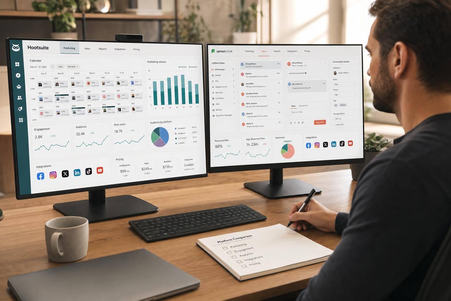
Feed planning tools are a game-changer for anyone looking to nail that perfect Instagram grid. They let you drag and drop images into a 3-column layout that mirrors your profile, making it easy to shuffle content around and spot any awkward color clashes or patterns before hitting "post".
These tools handle everything from single posts and carousels (up to 20 slides) to Reel covers, Stories, and even Highlights. Since Reel thumbnails show up as 1:1 squares on your main grid, you can upload custom covers to see how they blend with your overall aesthetic. Some platforms even take it a step further with AI-powered features like color palette analysis and layout scoring to help you refine your visual style.
Not all tools are created equal, though. Some focus purely on aesthetics - letting you arrange and preview your grid - while others bundle in extras like scheduling, auto-publishing, and even team collaboration tools like shareable links for client feedback. Security is key too, so look for planners that use official APIs (like the Meta API) and process images locally in your browser to keep your content safe.
These tools aren’t just about previews - they help you craft a cohesive, visually appealing feed. Whether you prefer web-based platforms, mobile apps, or desktop solutions, there’s something out there to fit your workflow.
Web-Based Planners
Web-based tools are all about simplicity and speed. Open your browser, drag in your images, and start arranging - no downloads, no sign-ups, no hassle. They’re perfect for quick visual checks or when you’re working on a shared computer. Plus, many of these tools process everything locally in your browser, so your images stay on your device unless you choose to sync them. They typically support common file types like JPG, PNG, and WEBP and often include shareable preview links for easy collaboration with clients or teammates.
The downside? These planners usually stick to grid aesthetics, so if you’re looking for scheduling or direct publishing, you’ll need to handle that elsewhere. But if your main goal is to perfect your grid’s look, these lightweight tools are a smart pick.
Mobile Apps for iOS and Android
For creators who live on their phones, mobile apps bring feed planning to your fingertips. These apps are designed for on-the-go workflows, offering grid previews, offline access, and dedicated views for Reels and Stories - not just the main feed. Many even sync securely with Instagram’s official API, so you can connect without worrying about your credentials.
"This is what I was missing. I drop in my drafts, shuffle them around, and instantly see what looks right. My grid finally feels intentional." - User Review, Gridley
Of course, working on a smaller screen can make it harder to catch subtle color flow issues compared to a desktop. But for creators who are always on their phones, the convenience and built-in filters make these apps a natural fit.
Desktop and Cross-Platform Solutions
Desktop and cross-platform tools are the go-to for teams and agencies. They sync across devices, so you can plan on your laptop, review on your tablet, and publish from your phone - all while managing multiple accounts. The larger screen makes it easier to spot details like diagonal color flow or patterns, and many platforms offer advanced features like AI-generated captions, hashtag suggestions, and tools for creating mosaic grids or cropping images for precise alignment.
These tools are ideal for teams managing client content or coordinating larger campaigns. With features like approval workflows, shared calendars, and auto-publishing, they keep everyone on the same page. Pricing typically starts at $13–$25 per month, making them a solid choice for teams or creators juggling multiple accounts.
Design Principles for a Cohesive Grid
A cohesive grid does more than just look good - it creates a strong first impression and keeps your audience engaged. In a world where your profile is often the first thing people see, a consistent and visually appealing grid can make all the difference in turning visitors into followers.
The switch to vertical (3:4) thumbnails in 2026 has shaken things up. Posts aren’t automatically cropped into squares anymore; now, they show up as taller rectangles. What does this mean for you? You’ve got to think about a "safe zone" when designing. Keep critical elements - like faces, text, or logos - centered in the middle 1:1 area of your vertical posts to ensure they’re visible in grid view. And if you’re adding text overlays, leave 10–12% padding from the edges to avoid awkward clipping.
Consistency is the name of the game, and it comes down to three key elements: your color palette, how you arrange your posts, and your editing style. Let’s dive into how you can nail each one.
Color Palette and Tone Consistency
Your color palette is like the glue that holds your grid together. A great starting point? The 60-30-10 rule. Use a dominant color (or neutral tones) for 60% of your grid - think backgrounds, lighting, and blank space. Add a secondary color for 30% (props, overlays), and finish with a bold accent color for the final 10% - perfect for calls-to-action or standout details.
But color alone won’t cut it. Your editing style has to tie everything together. To keep things consistent, stick to three main settings: temperature (warm or cool), contrast (soft or sharp), and saturation (muted or bright). This ensures your photos look cohesive, even if they’re shot in different lighting conditions. For text-based graphics, aim for a WCAG contrast ratio of at least 4.5:1 to make sure your text is easy to read and engaging.
Here’s a pro tip: Define specific hex codes for your colors. For example, pure white (#FFFFFF) and creamy white (#F8F5F2) might seem similar, but those subtle differences can throw off your grid when viewed as a whole. If you’re switching themes - say, from summer brights to autumn neutrals - use "bridge posts" with neutral tones and minimal designs to make the transition feel seamless.
Once your colors and editing style are locked in, it’s time to think about how to arrange your posts for maximum impact.
Post Arrangement and Layout Flow
The way you arrange your posts can make or break your grid’s vibe. Here are some popular layout styles to consider:
| Layout Style | How It Works | Best For |
|---|---|---|
| Checkerboard | Alternates two content types (e.g., photo/quote) | Coaches, educators |
| Row-by-Row | Each row of three posts shares a theme or color | Product brands |
| Column | Each vertical column has a distinct identity | Minimalist brands |
| Puzzle/Panorama | One large image split into 9 tiles | Launches, reveals |
| Borders | Consistent frames around posts | Photographers |
Planning in multiples of three - like 3, 6, or 9 posts - keeps your grid looking intentional and organized. Use tools to preview your next nine posts as a unit before publishing. This helps you catch any color imbalances, pattern breaks, or mismatched Reel covers that could ruin the flow. And speaking of Reels, don’t let the platform choose a random frame for your cover. Always upload a custom 9:16 cover and adjust the 1:1 crop to fit your grid’s aesthetic.
Switch up your formats to keep things interesting. Alternate between single images, carousels, and Reels to create a dynamic rhythm. Fun fact: Carousels that mix images and videos often see engagement rates of 2.33% compared to just 1.74% for single images.
Visual-Consistency Checklist
Here’s a quick checklist to keep your grid in check:
- Are key elements centered for the 3:4 crop? Make sure faces, text, and logos stay within the central 1:1 area.
- Does your color palette follow the 60-30-10 rule? Balance dominant, secondary, and accent colors across your grid.
- Is your editing consistent? Check that temperature, contrast, and saturation are uniform across your last nine posts.
- Is text contrast readable? A ratio of at least 4.5:1 ensures clarity and accessibility.
- Are custom Reel covers in use? Default video frames can clash with your aesthetic.
Take a step back and audit your grid every month to catch any "visual drift" - those small inconsistencies that can creep in over time. Look at your top 9–12 posts as a whole. If they feel chaotic, it might be time to archive the ones that don’t fit. Remember, your grid is like a visual resume - it’s often the first thing people notice, and it can be the deciding factor in whether they hit "follow" or keep scrolling.
Supported Content Formats: Tool Comparison
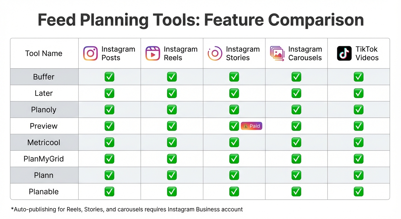
Instagram and TikTok Feed Planning Tools Feature Comparison
When it comes to visual planning tools, not all are built the same. Sure, most can handle Instagram grid posts and Reels, but things get trickier when you throw Stories, carousels, and TikTok videos into the mix. Picking the right tool means finding one that aligns with the content you create most often.
Let’s start with Instagram Reels. Every major planner worth considering - like Buffer, Later, Planoly, Preview, Metricool, and PlanMyGrid - offers custom cover planning. This feature is a game-changer for creators who want their Reel covers to fit seamlessly into their grid aesthetic. Carousel posts? Also covered. Tools such as Buffer, Later, Planable, and Metricool let you preview how multi-image posts will look within your grid, so you can keep everything visually cohesive.
Instagram Stories, however, are where things start to vary. While many tools let you plan Stories visually, full previews often come with a price tag. For instance, Preview App locks Story previews behind its premium plan. Then there’s the publishing hurdle - Instagram’s API doesn’t allow auto-posting for interactive features like stickers or links. Some tools rely on push notifications to remind you to post manually, which can be a bit of a hassle. If Stories are a big part of your strategy, make sure your tool offers either auto-publishing or timely reminders to keep you on track.
Now, let’s talk TikTok. For creators juggling multiple platforms, TikTok video support is a must. Tools like Later, Plann, and Planoly have stepped up, integrating TikTok planning into their dashboards. This is especially handy if you’re repurposing vertical videos. Fun fact: 68% of TikTok users say they remember brands better when those brands use songs they like. So, having a tool that helps you plan TikTok content alongside Instagram is a no-brainer.
Comparison Table
Here’s a quick look at how the top tools stack up across key content formats:
| Tool | Instagram Posts | Instagram Reels | Instagram Stories | Instagram Carousels | TikTok Videos |
|---|---|---|---|---|---|
| Buffer | ✅ | ✅ | ✅ | ✅ | ✅ |
| Later | ✅ | ✅ | ✅ | ✅ | ✅ |
| Planoly | ✅ | ✅ | ✅ | ✅ | ✅ |
| Preview | ✅ | ✅ | ✅ (Paid) | ✅ | ✅ |
| Metricool | ✅ | ✅ | ✅ | ✅ | ✅ |
| PlanMyGrid | ✅ | ✅ | ✅ | ✅ | ✅ |
| Plann | ✅ | ✅ | ✅ | ✅ | ✅ |
| Planable | ✅ | ✅ | ✅ | ✅ | ✅ |
One important thing to note: if you want to unlock auto-publishing for Reels, Stories, or carousels, most tools require you to switch to an Instagram Business account. Sticking with a personal account means you’ll have to deal with manual posting via push notifications, which can really slow you down - especially if you’re managing multiple posts daily.
Workflow: From Planning to Publishing
Upload and Arrange Posts
Take a quick glance at your last 9–12 posts. Notice any standout colors, patterns, or gaps? This mini-audit gives you a snapshot of what’s already clicking with your audience and where you can mix things up. Once you’ve nailed down your aesthetic, it’s time to map out your next move. Use a layout strategy (like the ones we talked about earlier) to give your feed that polished, eye-catching vibe.
Now, focus on your content pillars - 3 to 5 recurring themes like Education, Behind-the-Scenes, or Proof. These keep your feed dynamic and interesting. Upload your media files into a visual planner, then experiment with the drag-and-drop feature to test different arrangements. Planning in sets of three works wonders for Instagram’s three-column grid layout. Got vertical content? Stick to safe zone guidelines (like a 4:5 ratio), which not only look great but also boost engagement by 28% compared to square posts.
Scheduling and Auto-Publishing
Once your grid feels just right, it’s time to schedule. Batching your content in one go can cut your production time by a whopping 68%. Many tools let you schedule posts up to 75 days ahead, while Instagram’s native scheduler allows for up to 25 posts daily. Auto-publishing, through platforms like SocialBee, takes the hassle out of manual uploads, letting you focus on the bigger picture.
If you’re using structured patterns, keep your post sequence intact for that seamless look. Many scheduling tools also let you sync content across platforms like Instagram and TikTok, while still tweaking captions for each. And don’t forget to upload custom cover images for Reels during scheduling - this small detail can make your grid look extra cohesive. Profiles with a consistent aesthetic see a 33% boost in follow-through rates from visitors. With everything in place, you’re ready to dive into post-publication analysis.
Post-Publication Analytics
Once your posts go live, it’s time to see what’s working. Track key metrics like saves (a sign of lasting value) and DM shares (a strong indicator of engagement). Revisit your top 9–12 posts to pinpoint which colors, formats (think carousels vs. single images), and styles are resonating most with your audience.
Check out your "Profile Activity" insights to calculate your profile-visit-to-follow conversion rate. A cohesive grid can gradually improve this number over time. Make it a habit to review your most saved and commented-on posts every Sunday, tweaking your strategy for the week ahead. For a broader view, screenshot your grid monthly to track its evolution.
Choosing Features Based on User Needs
Visual planning tools aren’t one-size-fits-all - they’re as varied as the people using them. Whether you’re a solo creator, a small business owner, or part of a marketing agency, the features you need will depend on your goals. Let’s break it down.
For Individual Creators
If you’re building a personal brand, the right tools can help you turn your grid into a work of art. Start with unlimited grid space - it’s perfect for experimenting with layouts and aesthetics without limits.
Vertical formats are a must since they draw higher engagement. Tools with AI features, like automated caption suggestions and color analysis, can save time while boosting creativity. A drag-and-drop interface makes it easy to map out your grid, while safe zone overlays ensure your vertical content won’t get awkwardly cropped in a 1:1 view.
You’ll also need multi-format planning. Being able to preview Reels, Stories, and TikTok videos alongside static posts is a game-changer, especially since Reels currently get 2.5× more reach than static posts in the 2026 algorithm. Tools like Pallyy (priced at $20–$25/month) offer unlimited posts, while the Preview App provides free grid planning for creators who are mobile-first.
For Small Business Owners
Running a small business? You’ll want tools that simplify your social media game across multiple platforms. Scheduling features that work seamlessly for Instagram, TikTok, and others are key. Basic analytics are also essential for tracking what’s clicking with your audience - metrics like saves and DM shares are especially valuable in today’s algorithm.
Your grid isn’t just a collection of posts; it’s your visual resume. A polished grid can convert casual visitors into loyal customers. Tools like Planoly (starting at $14–$37/month) focus on visual-first grid planning with auto-posting, while Later (ranging from $16.67 to $25/month) supports robust scheduling across platforms.
"Your Instagram grid is the first thing people see when they visit your profile. It takes about 0.2 seconds for someone to form an impression."
– PostLink Team
To keep your feed fresh and engaging, focus on content pillars - three to five recurring themes that define your brand. Tools that allow custom Reel covers can help maintain that polished grid look.
For Marketing Teams and Agencies
For agencies juggling multiple clients, consistency is king. Tools that ensure a cohesive brand identity across accounts are non-negotiable. Approval workflows are a lifesaver, letting team members submit drafts, provide feedback, and secure sign-offs before anything goes live. Multi-account workspaces help you keep each client’s content separate and secure, while custom user roles make sure only the right people can edit or publish posts.
A unified social inbox is another must - it centralizes comments, DMs, and mentions across platforms, making community management far less chaotic.
When it comes to tracking performance, advanced reporting features are your best friend. Agorapulse, for example, is a favorite among over 3,000 agencies for its collaboration and reporting tools, with plans starting at $69/month.
"We've used Plann for yeeeears and we absolutely love the platform & brand itself. It's a social media content planning tool that is always ahead of the game."
– SBJ Studios Agency
For agencies scaling up, Sendible is a solid option. It starts at $29/month, and the cost per user decreases as you manage more profiles. If visual grid planning with client approval is a priority, Plann’s Grow Plan supports five or more social sets and four or more team members for $62.50/month.
Conclusion: Start Planning Your Visual‑First Feed
Your Instagram or TikTok grid is so much more than a random collection of posts - it’s your digital storefront. In just seconds, a well-planned feed can signal professionalism, build trust, and sway visitors to hit that "follow" button instead of scrolling past. Think of it as your brand’s handshake in the digital world.
Visual planning tools take the guesswork out of creating that polished, cohesive look. By batching content and previewing your grid before hitting publish, you can keep your feed looking sharp while saving time and effort. With algorithms in 2026 favoring saves, shares, and DMs over basic likes, planning ahead means you’re not just posting - you’re connecting with your audience in ways that matter.
The tools available today don’t just make your posts look good; they make sure they perform. Features like vertical format support (4:5 or 3:4), safe zone previews, and even AI content creation tools help ensure your content checks all the right boxes. Whether you’re a solo creator using free grid planners or an agency juggling multiple accounts with advanced approval workflows, there’s a tool tailored to your needs.
Want to nail that first impression? Start with a grid preview. Arrange your posts to balance colors and ensure safe zone alignment. Whether you’re sticking to a 60-30-10 content mix, planning in 9-post grids, or using the "sandwich" method to guide visitors toward your goals, the mission is the same: turn profile visitors into loyal followers.
Bottom line? Your grid is your brand’s story - make it count. Let visual planning do the heavy lifting so your feed can work harder for you.
FAQs
Do I need a Business account to auto-post?
No, you don’t need a Business account to auto-post on Instagram or TikTok. Some scheduling tools work just fine with personal accounts for auto-posting. Just make sure to double-check the features of the tool you’re using to see if it supports your account type.
How do I design for the new 3:4 grid crop?
When crafting content for Instagram's 3:4 grid crop, aim for a 4:5 aspect ratio - that's 1080 × 1350 pixels. This ensures minimal cropping while keeping your visuals sharp. To avoid important details getting cut off, keep all key elements within the 1:1 safe zone (1080 × 1080 pixels). This way, your content looks great in both square and vertical formats. Want your profile to stand out? Use visual planning tools to preview your grid and create a polished, cohesive feed.
Which tool supports Reels, Stories, and TikTok together?
The tool mentioned in the article is a game-changer for creators juggling Reels, Stories, and TikTok content. It lets you upload and schedule Instagram Reels, neatly organize Instagram Stories, and handle TikTok posts - all from one platform. Plus, it's officially approved by Instagram, so you can trust it's safe to use. If you're looking for a streamlined way to visually plan content across these formats, this platform has got you covered.